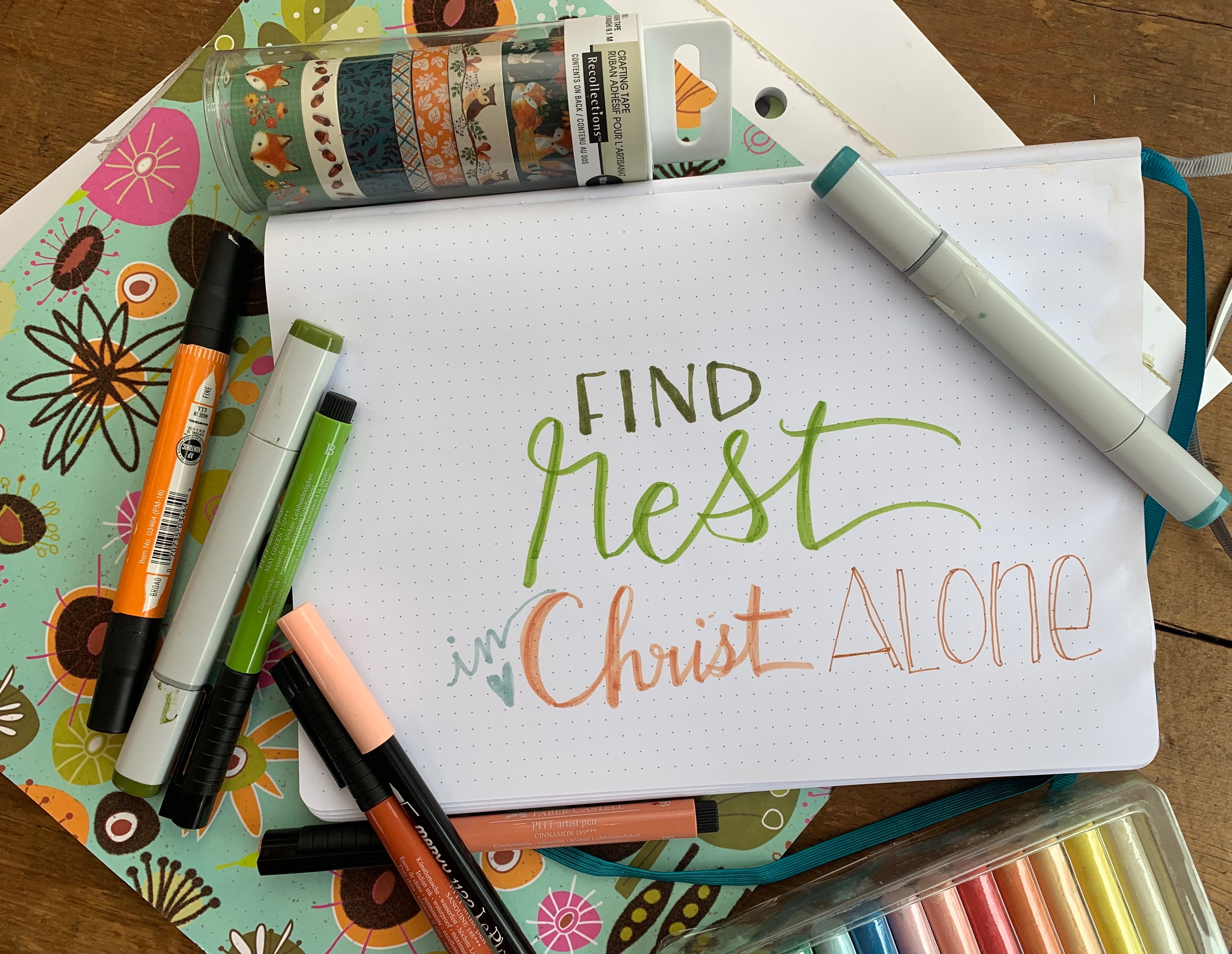
DIY: How to Coordinate Colors When Bible Journaling to Create a Personalized Gift

DIY
How to Coordinate Colors When Bible Journaling to Create a Personalized Gift

Welcome to the From the Heart Art Blog, where I share weekly inspiration to encourage & uplift you on your faith journey!
From stories behind the art I create to behind-the-scenes looks into the creation process to DIY tutorials and more... I post a new blog post every single Wednesday to share, uplift, & encourage you on your journey! Welcome to the blog & I can't wait to connect with you through this new blog space every single week. If you want to know when new blog posts go live, make sure to join our exclusive email newsletter community! Click here to join Lemonade Creative Hearts!
Color Is Everywhere
I love color! It is fascinating to me how color affects our mood and is a part of so many parts of our life. Slow down and look around... it’s everywhere!
What colors do you notice when you take a few minutes and look around outside? I’m sure you see blue, green and brown, but look closer at the variations of each color. Last week, I shared some colors of Fall in my yard.
Because I love ALL the colors, it often gets overwhelming to me to narrow down what to put in a piece of art I’m creating or in the lettering project I’m working on. I love them all and don’t want to leave "anyone” out! But trying to include all the colors into a piece is going to make it too busy and crowded.

3 Tips for Picking a Color Palette
I would love to show you three things I often use for reference to help me start narrowing down my color palette. You could use these same tips when choosing a color palette for a room in your house, an outfit you might wear, a home decor project, a gift you are making, or for your lettering project.

Tip 1: Let Fabric Guide You!
Visit your closet. What are your favorite blouses or dresses? They are possibly your favorite because of the fabric color or pattern.
Visit a Hobby Lobby or Joanne’s Stores to walk up and down their aisles. Visit one of your favorite clothing stores, too! What fabric grabs your attention? Look at it closely.
The fabric can actually guide you in choosing your color palette! Pay attention not only to the colors used in the piece, but also how often it’s used in the fabric. Which one is the dominant color? Which one is the accent color?
I have several skirts that I’ve held onto for years, they don’t even fit me anymore, but I love the fabric! Recently, I gave them to my mom and she cut them down and made a beautiful quilt for me!


Tip 2: Let Scrapbook Paper Inspire You!
Do you have scrapbook paper at home? If not, next time you visit your favorite craft store, visit their scrapbook paper aisle. It is amazing what you can learn there!
A book of scrapbook paper typically has a single color palette for the entire book. Slowly look at all the books. Once you find your favorite book, look closely at the pages within. Find your favorite page in the book, because that page can guide you just like the fabric does.
Remember, the questions to answer are: What’s the dominant color? What’s the accent color? What color catches your eye first? What color is used the least in that piece? Which is your favorite color?
A book of Scrapbook Paper is almost comparable to an encyclopedia! Pay attention to all the other pages in the book, you will find examples of how to use other colors as the background and notice all the different ratios used for each color of their color palette. It is a great way to get your creative juices flowing!


Tip 3: Use Washi Tape (a Set Is Even Better)
I love washi tape! I use it to decorate the lettering pages in my journal, to add color & fun to envelopes and packages, to mark things that belong to me (like phone chargers), to mark pages in books, etc…
Well, washi tape tells a color story, too! I love to go to Hobby Lobby or Michaels and look at their sets of washi tape. I like to coordinate my pens to match the washi tape that I'm going to be using in my journal.
Washi tape is like the perfect necklace to go with your favorite dress! Washi tape is just one more thing to give me really good clues about which colors work well together!

Have fun exploring all the possibilities of color combinations. Happy creating!
I will have a full tutorial on picking colors to create a beautiful color palette in our Lemonade Creative Bible & Scripture Lettering membership. We would love to have you join us! Click here for More information!
Sincerely,
Pam Coxwell | From the Heart Art

Leave a comment